Content dashboards transform data chaos into meaningful insights that drive strategic decisions. They connect your content efforts to real business outcomes, helping you prove ROI and optimize performance. This guide will show you how to build, implement, and leverage performance dashboards that tell your content’s complete story across all channels.
What Are Content Performance Dashboards and Why Are They Essential?
Content performance dashboards are visual representations that consolidate key metrics to track and analyze the effectiveness of your content marketing initiatives. They transform complex data into actionable insights that inform strategic decisions.
These centralized visualization systems bring together metrics from multiple channels and platforms, creating a single source of truth for content performance. Unlike static reports, dashboards provide real-time or near real-time updates that allow for agile decision-making.
According to Content Marketing Institute, organizations with documented content measurement systems are 33% more likely to report success than those without structured performance tracking. This stark difference highlights why dashboards matter.
- Time efficiency: Reduce reporting time by 60-80% through automation
- Strategic alignment: Connect content activities directly to business objectives
- Resource optimization: Identify high-performing content types for better allocation
- Performance improvement: Spot optimization opportunities faster
Dashboards come in different forms based on purpose: strategic dashboards focus on high-level KPIs, operational dashboards track day-to-day performance, and analytical dashboards enable deep-dive investigations into trends and patterns.
Key Business Benefits of Implementing Content Dashboards
Implementing content performance dashboards delivers several measurable business benefits that extend beyond basic reporting.
- Time savings: Marketing teams save an average of 5-7 hours weekly through automated dashboard reporting
- Improved decision-making: Visual data processing increases insight detection by 28% compared to spreadsheet analysis
- Better resource allocation: Identify top-performing content types to focus creation efforts
- Stronger content strategy alignment: Link tactical metrics to strategic business objectives
- Enhanced stakeholder communication: Share results in formats tailored to different audience needs
Case study: A B2B software company implemented a comprehensive content dashboard system and increased content-attributed revenue by 32% within six months by reallocating resources to high-converting content types identified through their dashboard insights.
The Comprehensive Content Metrics Framework: What to Measure and Why
Selecting the right metrics begins with understanding the complete content performance ecosystem. This framework organizes metrics by business objective and content lifecycle stage.
Effective measurement requires a holistic approach that captures the entire content journey from initial visibility through long-term audience relationships. Each metric category answers specific questions about your content’s performance:
- Consumption metrics: Is your content being seen?
- Engagement metrics: Is your content resonating?
- Conversion metrics: Is your content driving actions?
- Retention metrics: Is your content building relationships?
The distinction between vanity metrics and business impact metrics is crucial. Vanity metrics like total page views might look impressive but often lack actionable insights. Business impact metrics directly connect to organizational objectives and revenue generation.
Understanding the relationship between leading and lagging indicators helps predict future performance. Leading indicators (like engagement rates) signal potential outcomes before lagging indicators (like conversion rates) confirm them.
The most valuable dashboard insights often come from connecting metrics across categories. For example, correlating consumption patterns with conversion rates reveals which content types attract high-quality visitors versus those that generate traffic without business impact.
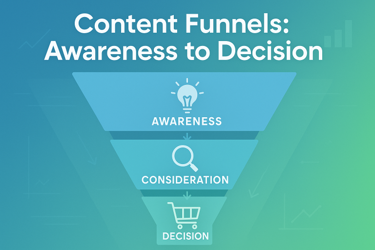
Consumption and Awareness Metrics
Consumption metrics measure how your audience discovers and consumes your content, providing the foundation for understanding content reach and visibility.
These top-of-funnel metrics establish your content’s initial footprint and audience reach:
- Page views: Total content views within a period (benchmark: varies by industry, typically 500-1,000 monthly views per strategic piece)
- Unique visitors: Individual users who accessed your content (typically 70-85% of total page views)
- Traffic sources: Channels driving visitors (organic search, social, email, direct)
- Time on page: Average time spent consuming content (benchmark: 2+ minutes for blog content)
- Scroll depth: How far users progress through content (50%+ is considered good engagement)
When analyzing consumption metrics, segment by channel, device type, and content format. This reveals where your audience prefers to discover and consume your content.
GA4 requires different measurement approaches compared to Universal Analytics. Focus on “engaged sessions” rather than bounce rate, and use the “engagement rate” metric for content quality assessment.
Common pitfall: Focusing solely on volume metrics without considering quality signals. High traffic with low engagement often indicates misalignment between content and visitor intent.
Engagement and Interest Metrics
Engagement metrics reveal how your audience interacts with your content, providing crucial signals about relevance and interest level.
These mid-funnel metrics indicate content resonance and quality:
- Average engagement time: Time actively interacting (benchmark: 1:30+ for blog posts)
- Social shares: Distribution via audience networks (benchmark varies by platform)
- Comments/responses: Direct audience feedback (quality often matters more than quantity)
- Click-through rate: Percentage clicking on calls-to-action (benchmark: 1-3% for in-content CTAs)
- Page depth: Number of pages viewed per session (benchmark: 2+ pages indicates strong interest)
Engagement metrics often provide early indicators of content success before conversion metrics materialize. They signal audience interest and content-audience fit.
Cross-channel engagement correlation reveals valuable insights. For example, content that generates high social engagement but low website engagement may indicate issues with landing page experience or content expectations.
Content type significantly impacts expected engagement benchmarks. Informational content typically generates higher time-on-page, while commercial content often shows higher CTRs but shorter engagement times.
Conversion and Action Metrics
Conversion metrics connect content performance directly to business outcomes, measuring how effectively your content drives desired actions.
These bottom-funnel metrics demonstrate tangible business impact:
- Conversion rate: Percentage of visitors completing desired actions (benchmark: 1-5% for lead generation, varies by industry)
- Goal completions: Total conversions attributed to content (segmented by conversion type)
- Cost per conversion: Resources required to generate each conversion
- Content-attributed revenue: Sales value connected to content touchpoints
- Lead quality score: Qualification rate of content-generated leads
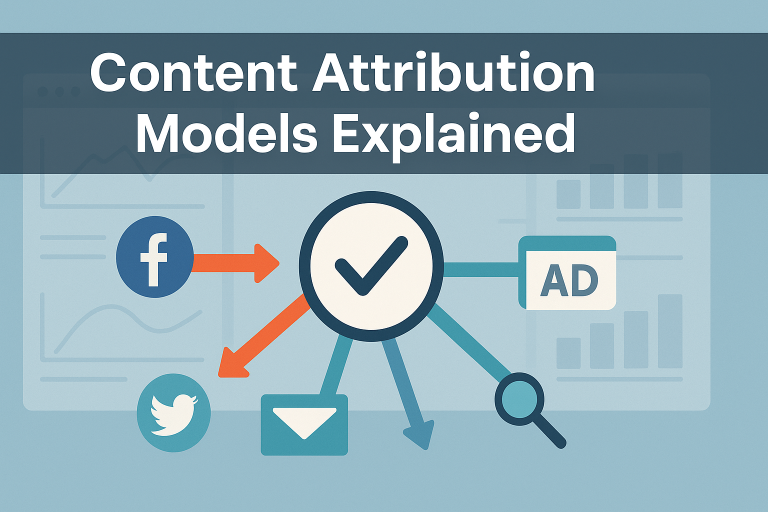
Attribution models significantly impact how conversions are distributed across content. Common models include:
- First-touch: Credits initial content interaction
- Last-touch: Credits final content interaction
- Linear: Distributes credit equally across all touchpoints
- Position-based: Weights first and last interactions more heavily
- Data-driven: Algorithmically determines credit based on impact patterns
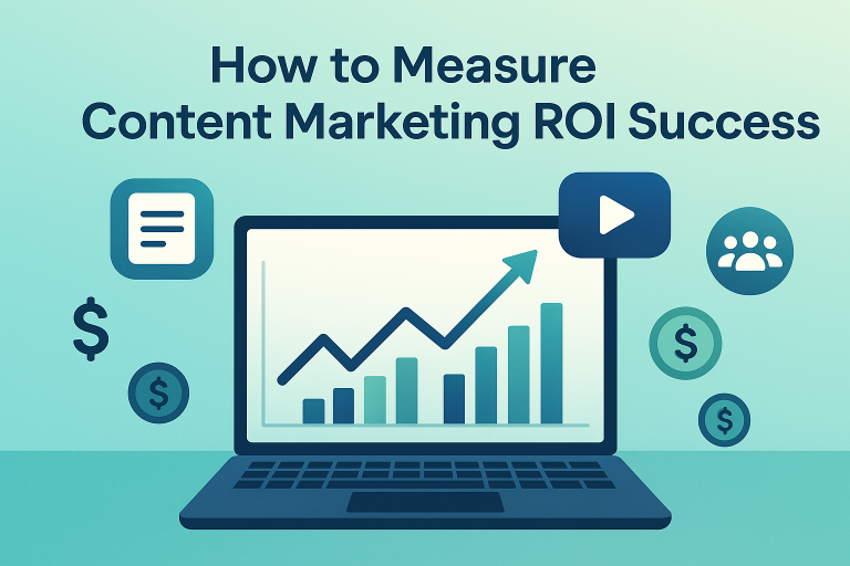
The ROI calculation for content requires connecting multiple data points: ROI = ((Revenue attributed to content – Content production and distribution costs) / Content costs) × 100
In cookieless environments, content attribution models require adaptation through server-side tracking, first-party data strategies, and probabilistic matching methodologies to maintain conversion visibility.
Retention and Loyalty Metrics
Retention metrics measure how your content builds audience relationships over time, a crucial indicator of sustainable content performance.
These relationship-building metrics reveal long-term content impact:
- Return visitor rate: Percentage of repeat visitors (benchmark: 15-30% indicates healthy engagement)
- Subscription rate: Visitors who opt into ongoing communication (benchmark: 1-3% for newsletter signups)
- Content consumption frequency: How often the same users engage with content
- Unsubscribe rate: Audience attrition (benchmark: below 0.5% monthly is healthy)
- Lifetime value (LTV): Revenue generated from audience relationships over time
Audience lifetime value calculation for content requires tracking multi-touch relationships: LTV = (Average purchase value × Purchase frequency × Average customer lifespan)
Content consumption patterns for loyal audiences often differ from new visitors. Return visitors typically consume more in-depth, specialized content and convert at 2-3× higher rates.
The most valuable retention metric often overlooked is content-specific loyalty, which measures how individual pieces build return readership rather than just site-wide retention.
Building Role-Based Dashboards: Tailoring Metrics for Different Stakeholders
Different stakeholders need different metrics to make decisions. A role-based dashboard approach ensures everyone sees the metrics most relevant to their responsibilities.
The role-based framework aligns dashboard content with specific information needs and decision-making authority:
Each stakeholder group requires different metrics, visualization styles, and update frequencies:
- Executives: Need high-level KPIs connecting content to business outcomes
- Marketing managers: Require balanced metrics across the funnel for strategic optimization
- Content creators: Benefit from content-specific performance data for improvement
- Agencies: Need client-relevant metrics that demonstrate service value
- Small business owners: Require focused metrics with clear ROI connections
Dashboard design should match decision-making frequency. Executive dashboards typically update monthly or quarterly, while operational dashboards for content teams may update daily or weekly.
Common dashboard mistake: Creating a single, comprehensive dashboard that serves no one effectively. Multiple targeted dashboards typically provide more value than one complex dashboard trying to serve all purposes.
Cross-referencing insights between role-based dashboards creates valuable perspective. For example, content creators might identify a high-performing format that marketing managers can then scale across campaigns.
Executive Dashboard: Proving Content’s Business Impact
Executives need dashboards that connect content activities to business outcomes in clear, concise formats.
Executive dashboards should prioritize business impact over tactical metrics, focusing on these key elements:
- Content-attributed revenue: Financial impact directly connected to content
- Conversion trends: Pattern visualization of content-driven actions
- Cost per acquisition: Efficiency of content in generating customers
- Market share indicators: Search visibility and share of voice metrics
- Year-over-year growth: Long-term performance trajectory
Effective executive dashboards use simple visualizations with clear insights. Limit charts to 5-7 high-impact visuals with executive summaries highlighting key findings and recommendations.
Update frequency should align with executive review cycles, typically monthly or quarterly, with the ability to drill down into specific areas of interest or concern.
ROI visualization works best through comparison frameworks that show content performance relative to other marketing investments, clearly demonstrating the value proposition of content marketing.
The most effective content marketing ROI presentations connect to executive priorities, whether that’s market expansion, customer acquisition, or brand authority building.
Marketing Manager Dashboard: Optimizing Content Strategy and Performance
Marketing managers need comprehensive dashboards that balance strategic oversight with tactical optimization opportunities.
Manager dashboards should provide both high-level performance views and detailed breakdowns for strategic adjustments:
- Channel performance comparison: How content performs across distribution channels
- Content type analysis: Performance patterns by format (blog, video, infographic)
- Topic cluster performance: Effectiveness of related content groups
- Funnel conversion visualization: Content journey from awareness to conversion
- Keyword position tracking: Search visibility for strategic terms
- Competitor content comparison: Relative performance against key competitors
Content strategy alignment indicators help managers connect tactical execution to strategic goals. These include theme performance metrics, audience segment engagement, and brand messaging effectiveness.
Performance trend visualization should highlight patterns over at least three time periods to identify meaningful trends versus temporary fluctuations.
Channel effectiveness comparison reveals where content performs best across the marketing ecosystem, enabling resource optimization across paid, owned, and earned media.
Content gap identification metrics help managers spot opportunities by analyzing search demand against existing content inventory, revealing high-potential topics for development.
Content Creator Dashboard: Improving Content Quality and Impact
Content creators need dashboards that provide actionable insights for content optimization and audience understanding.
Creator dashboards should focus on content-specific performance data with clear optimization indicators:
- Content engagement metrics: Time on page, scroll depth, interaction rate
- Search performance: Rankings, click-through rates, featured snippet capture
- Content consumption patterns: Reading behavior, drop-off points
- Audience feedback signals: Comments, shares, ratings
- Conversion attribution: Actions generated by specific content
Content-specific performance indicators should be benchmarked against similar content types rather than site-wide averages. This provides more accurate performance context.
Audience behavior signals help creators understand how content is consumed. Heat maps, scroll maps, and click tracking visualize user engagement patterns that might not be apparent in aggregate metrics.
Content improvement opportunities should be highlighted through actionable insights, not just data. For example, “40% drop-off at paragraph 8 suggests restructuring needed” provides clearer direction than raw bounce rates.
Competition benchmarking helps creators understand performance context. Comparing engagement metrics against industry leaders for similar content types establishes realistic improvement targets.
Implementing Cross-Channel Content Performance Tracking
Content performance spans multiple channels and platforms. A cross-channel tracking approach reveals the complete customer journey and content impact.
Modern content consumption happens across diverse touchpoints, requiring integrated measurement systems:
- Website content: Blog posts, landing pages, resource centers
- Social media content: Platform-native posts, videos, stories
- Email content: Newsletters, nurture sequences, broadcasts
- Multimedia content: Podcasts, videos, webinars
- Third-party content: Guest posts, PR mentions, syndication
Cross-channel attribution requires a unified data model that connects interactions across platforms. This typically involves:
- Implementing consistent UTM parameters for channel identification
- Creating unique content identifiers that work across platforms
- Establishing user identification systems (where privacy-compliant)
- Normalizing engagement metrics across channels
- Building data pipelines that feed into a central dashboard
First-party data collection becomes increasingly crucial for cross-channel tracking. Methods include logged-in experiences, progressive profiling, and owned audience channels like email and SMS.
Channel interaction analysis techniques reveal how audiences move between platforms. Flow visualizations and multi-touch attribution models help understand the content ecosystem’s interconnected nature.
Content journey mapping connects disparate touchpoints into coherent user paths. This visualization helps identify where content successfully moves users through the funnel versus where drop-offs occur.
Privacy-First Content Measurement in a Cookieless World
Privacy regulations and technology changes are transforming content measurement. A privacy-first approach ensures sustainable performance tracking.
Major privacy changes affecting content measurement include:
- iOS14+ tracking limitations: Restricted identifier access
- GDPR and CCPA regulations: Consent requirements and data limitations
- Third-party cookie deprecation: Phasing out of cross-site tracking
- Browser tracking prevention: Safari ITP and Firefox ETP restrictions
First-party data collection strategies provide sustainable measurement alternatives:
- Authenticated experiences: Value exchange for identity
- Server-side tracking: Moving measurement to controlled environments
- Data clean rooms: Privacy-safe environments for data collaboration
- Contextual analysis: Content performance by topic and context
Server-side tracking moves data collection from browsers to servers, providing more control and reliability. This approach helps mitigate client-side blocking while maintaining user privacy through proper data handling.
Contextual analysis techniques focus on content performance within specific contexts rather than individual user tracking. This approach evaluates content effectiveness based on topic, format, and placement without requiring personal identifiers.
Modeled conversions use statistical methods to estimate attribution when direct tracking isn’t possible. These probabilistic approaches maintain measurement capabilities while respecting privacy boundaries.
Selecting and Implementing Dashboard Tools: A Comprehensive Comparison
Choosing the right dashboard platform is crucial for sustainable content performance measurement. This comparison helps you select the optimal tool for your specific needs.
| Tool | Cost | Technical Expertise | Data Integration | Best For |
| Google Data Studio (Looker Studio) | Free | Low-Medium | Strong Google ecosystem, moderate third-party | Teams with Google Analytics as primary data source |
| Tableau | $70+/month | Medium-High | Extensive | Enterprise with complex data visualization needs |
| Power BI | $10+/month | Medium | Strong Microsoft ecosystem, good third-party | Microsoft-centric organizations |
| Databox | $59+/month | Low | Good pre-built connectors | Marketing teams needing quick implementation |
| Klipfolio | $49+/month | Low-Medium | Extensive marketing integrations | Marketing agencies handling multiple clients |
Free vs. paid options analysis reveals important trade-offs. Free tools like Google Data Studio offer solid functionality but may require more manual work for complex visualizations. Paid tools typically provide more automation, pre-built templates, and advanced features.
Technical expertise requirements vary significantly between platforms. Consider your team’s capabilities when selecting a tool. Platforms like Databox require minimal technical knowledge, while Tableau demands more analytical expertise to maximize value.
Data integration capabilities directly impact implementation time and ongoing maintenance. Evaluate native connectors for your specific marketing stack. Some platforms excel with specific ecosystems (Google, Microsoft) while others offer broader third-party integration.
Customization flexibility differs across platforms. Some tools provide complete design freedom but require more setup time, while others offer limited customization but faster implementation through templates.
When starting with content marketing ROI measurement, consider beginning with a simpler tool that can grow with your needs rather than implementing a complex system that may overwhelm your team initially.
Step-by-Step Google Data Studio Setup for Content Performance
Google Data Studio offers powerful content performance visualization capabilities with minimal investment. Follow this process to create your custom content dashboard.
- Create a new report: Log into Data Studio and select “Create → Report”
- Connect data sources: Add Google Analytics 4 as your primary data source
- Select your GA4 property
- Choose the appropriate data stream
- Configure date ranges (recommend trailing 13 months)
- Add additional data sources: Connect complementary platforms
- Search Console for keyword performance
- Google Sheets for content inventory
- Third-party connectors for social media data
- Create dashboard structure: Build your framework
- Add report header with title and date range selector
- Create separate pages for different metric categories
- Add filter controls for content type, channel, and date ranges
- Configure essential charts:
- Traffic overview (line chart with source breakdown)
- Content performance table (URL, views, engagement, conversions)
- Conversion funnel visualization
- Channel comparison bar chart
- Goal completion scorecards
For sharing and collaboration, use the “Share” button to control access levels. You can grant view-only access to stakeholders or editing capabilities to team members. Schedule automated email delivery of reports for regular updates.
Common troubleshooting tips include refreshing data sources when metrics appear outdated, checking dimension compatibility when charts display errors, and using calculated fields to create custom metrics not available in standard reports.
For easier implementation, utilize community templates available in the Data Studio template gallery. These provide starting points that can be customized to your specific needs rather than building from scratch.
Automating Content Performance Reporting: Efficiency and Consistency
Manual reporting consumes valuable time and introduces inconsistency. Automation creates reliable, efficient reporting workflows that save hours each week.
The time-saving potential of automated reporting is substantial. Marketing teams typically spend 4-7 hours weekly on manual reporting tasks. Automation can reduce this by 80%, freeing approximately 16-28 hours monthly for strategic work.
An effective reporting automation workflow follows this sequence:
- Data collection: Automated API connections to source platforms
- Data processing: Scheduled transformations and calculations
- Dashboard refreshing: Automatic updates at defined intervals
- Alert generation: Notifications for significant changes or thresholds
- Report distribution: Scheduled delivery to stakeholders
API integration approaches vary by dashboard platform. Native connectors provide the simplest implementation, while custom API connections offer more flexibility for specialized data sources. Tools like Supermetrics, Funnel.io, and Zapier can bridge gaps between platforms.
Alert configuration for metrics ensures proactive monitoring. Set thresholds for significant changes:
- Traffic fluctuations (±20% week-over-week)
- Conversion rate changes (±10% from baseline)
- Ranking drops for high-value keywords
- Engagement anomalies by content type
Scheduled reporting setup should align with decision-making cadences. Consider different frequencies for different metrics and stakeholders:
- Daily: Traffic and basic engagement metrics
- Weekly: Conversion metrics and content performance
- Monthly: Strategic KPIs and trend analysis
- Quarterly: Comprehensive performance reviews
Data refresh frequency recommendations depend on metric volatility and business impact. High-impact metrics like conversion rates warrant more frequent updates (daily or real-time), while more stable metrics like SEO rankings may need only weekly refreshes.
Creating Automated Insight Extraction Systems
Beyond automating data collection, modern dashboards can automatically surface insights and anomalies that require attention.
Insight automation frameworks operate on three levels:
- Descriptive: What happened? (metrics, comparisons, trends)
- Diagnostic: Why did it happen? (correlation analysis, causal factors)
- Prescriptive: What should we do? (recommendations, next actions)
Anomaly detection configuration identifies performance outliers that require investigation. Effective systems detect:
- Statistical deviations from historical patterns
- Sudden changes in key performance indicators
- Metric relationships that break established correlations
- Unexpected performance by channel or content type
Threshold-based alerting sends notifications when metrics cross predefined boundaries. This ensures teams respond quickly to both problems and opportunities. Configure alerts for both negative thresholds (traffic drops) and positive thresholds (conversion spikes).
AI-powered analysis techniques increasingly augment human analysis. Capabilities include:
- Pattern recognition across large datasets
- Automatic segment discovery based on behavior
- Natural language processing for content performance correlation
- Predictive models for content performance forecasting
Natural language generation for insights translates data patterns into readable summaries. This technology creates automated narrative explanations of dashboard data, making insights accessible to non-technical stakeholders.
Action recommendation systems suggest specific next steps based on detected patterns. These systems connect insights to tactical responses, closing the loop between measurement and optimization.
From Data to Decisions: Extracting Actionable Insights from Content Dashboards
A dashboard is only valuable if it drives better decisions. This insight extraction framework turns dashboard data into strategic content actions.
The data storytelling framework transforms raw metrics into strategic narratives:
- Context: What’s the current situation and background?
- Observation: What patterns or anomalies appear in the data?
- Insight: What does this mean for our content strategy?
- Decision: What actions should we take based on this understanding?
- Expected outcome: What results do we anticipate from these actions?
The insight extraction methodology follows a structured process to prevent missing important signals:
- Review high-level KPIs for significant changes
- Segment data by key dimensions (content type, channel, audience)
- Compare performance across time periods
- Identify correlations between metrics
- Investigate anomalies and unexpected results
Pattern recognition techniques help identify meaningful trends versus random fluctuations. Look for:
- Consistent performance differences between content categories
- Audience behavior patterns across the content journey
- Correlation between content attributes and conversion rates
- Seasonal or cyclical performance patterns
The content optimization workflow connects insights to specific improvements:
- Identify underperforming content with improvement potential
- Diagnose specific performance issues (engagement, conversion, etc.)
- Develop hypothesis for improvement
- Implement targeted changes
- Measure impact through A/B testing
A/B testing approaches based on dashboard data enable systematic improvement. Test variations of high-potential content to optimize performance incrementally. Prioritize tests based on traffic volume and conversion impact to maximize ROI.
Case study: A SaaS company used dashboard insights to identify that their how-to content generated 3× more qualified leads than thought leadership pieces. By shifting their content mix to 60% how-to content, they increased lead volume by 47% while maintaining quality scores.
Data Storytelling: Communicating Content Performance to Stakeholders
Presenting dashboard data effectively requires more than charts. It requires a compelling narrative that connects metrics to business outcomes.
The data storytelling framework for content performance follows this structure:
- Headline: The main finding or recommendation
- Context: Relevant background information
- Evidence: Key metrics and trends supporting the finding
- Significance: Why this matters to business objectives
- Next steps: Recommended actions based on the insight
Presentation techniques vary by audience type:
- Executives: Focus on business outcomes and strategic implications with minimal technical detail
- Marketing leaders: Balance strategic insights with tactical opportunities
- Content teams: Provide detailed performance data with specific optimization guidance
- Cross-functional partners: Emphasize shared objectives and collaborative opportunities
Visualization best practices enhance understanding:
- Use consistent color coding for metric categories
- Limit each chart to one clear insight
- Provide context through benchmarks and targets
- Use the appropriate chart type for each data relationship
- Include text annotations to highlight key points
Meeting structure for performance reviews should follow a consistent format:
- High-level performance summary (3-5 minutes)
- Key wins and opportunities (5-7 minutes)
- Deep dive into priority areas (10-15 minutes)
- Action planning based on insights (10 minutes)
- Next steps and accountability assignments (5 minutes)
Handling negative performance conversations requires preparation. Frame underperformance as learning opportunities, focus on specific causes rather than blame, and always come prepared with improvement hypotheses and next steps.
Advanced Content Performance Measurement: Predictive Analytics and AI
The future of content performance dashboards lies in predictive analytics. Moving from reporting what happened to forecasting what will happen.
Predictive content analytics uses historical performance data to forecast future outcomes. This approach helps content teams anticipate results rather than just react to them.
Machine learning applications for content performance include:
- Performance forecasting: Projecting content results based on historical patterns
- Audience segmentation: Identifying behavioral clusters for targeting
- Content optimization: Predicting which elements drive engagement
- Topic recommendation: Suggesting high-potential content themes
- Automated insight generation: Surfacing patterns humans might miss
Content performance prediction models typically incorporate multiple variables:
- Historical performance by content type
- Seasonal and time-based patterns
- Topic and keyword trends
- Audience behavior patterns
- Channel-specific performance factors
Content topic forecasting techniques analyze search trends, social engagement patterns, and competitive content performance to identify high-potential topics before they peak.
AI-powered content optimization evaluates content elements against performance data to recommend improvements. These systems can suggest optimal headlines, content length, format, and structure based on audience response patterns.
The implementation roadmap for predictive analytics follows these stages:
- Build robust historical data foundation (6+ months data)
- Develop basic forecasting models for key metrics
- Implement content classification for pattern analysis
- Train models on your specific content performance
- Integrate predictions into planning workflows
Realistic expectations for predictive analytics are important. Early implementations typically achieve 60-70% prediction accuracy, improving over time with more data and model refinement. Focus initial efforts on high-volume content types where patterns are more stable.
Industry-Specific Content Dashboard Frameworks
Content performance metrics vary significantly by industry. These sector-specific frameworks highlight the most relevant metrics for different business types.
Core metric priorities differ substantially across industries based on business models and content objectives:
| Industry | Primary Metrics | Secondary Metrics | Unique Considerations |
| B2B Services | Lead quality, pipeline influence | Time on page, resource downloads | Long sales cycles require multi-touch attribution |
| E-commerce | Revenue per visit, add-to-cart rate | Product view rates, review engagement | Short conversion windows, seasonal patterns |
| SaaS | Trial signups, feature adoption | Documentation usage, support deflection | Content serves both acquisition and retention |
| Media/Publishing | Page RPM, subscription conversion | Recirculation rate, ad viewability | Revenue directly tied to engagement metrics |
| Non-profit | Donation conversion, volunteer signups | Story sharing, advocacy actions | Multiple conversion types beyond financial |
B2B content dashboard frameworks emphasize the customer journey through extended sales cycles. Key metrics include:
- Marketing qualified leads (MQLs) from content
- Sales qualified leads (SQLs) influenced by content
- Pipeline value attributed to content touchpoints
- Content engagement by account (for ABM)
- Sales enablement content utilization
E-commerce content dashboard frameworks focus on purchase behavior and product discovery:
- Product page traffic from content
- Add-to-cart rate from content pages
- Average order value influenced by content
- Review and UGC engagement metrics
- Product discovery through content
SaaS content dashboard frameworks track both acquisition and user success:
- Trial signup conversion from content
- Feature adoption influenced by educational content
- Customer retention correlation with content consumption
- Help content effectiveness (issue resolution rate)
- Community content engagement
Small business frameworks prioritize resource-efficient metrics with direct ROI connections. These simplified dashboards focus on high-impact metrics that directly influence revenue without requiring complex analytics infrastructure.
Many businesses make common mistakes in content marketing ROI measurement by applying generic frameworks instead of industry-specific approaches, leading to misaligned metrics and strategies.
Measuring Content Team Performance: Beyond Content Metrics
A complete content performance system includes team productivity and efficiency metrics alongside content effectiveness measures.
The content team performance framework balances output, quality, and impact metrics:
- Production metrics: Volume, velocity, and resource utilization
- Quality metrics: Content effectiveness and audience response
- Impact metrics: Business outcomes and strategic contribution
Production efficiency metrics help optimize resource utilization:
- Content production rate: Pieces completed per time period
- Time to publish: Duration from ideation to publication
- Resource allocation: Hours/cost per content piece by type
- Workflow efficiency: Time in each production stage
- Team capacity utilization: Actual vs. available production hours
Content quality scoring systems provide objective quality assessment:
- Performance-based scoring (engagement, conversion metrics)
- Criteria-based evaluation (checklist completion, standards adherence)
- Audience feedback mechanisms (ratings, surveys, comments)
- Technical quality measures (readability, SEO alignment)
Team productivity indicators reveal operational efficiency:
- Output per team member
- Revision cycles per content piece
- Deadline adherence percentage
- Skill development metrics
Cost per content type analysis helps optimize budget allocation. Track fully-loaded costs (including team time, freelance expenses, and production tools) for each content format to identify the most cost-effective content types for different objectives.
Resource allocation optimization uses performance data to maximize team impact. Analyze which content types, topics, and channels deliver the best results per hour invested, then adjust team focus accordingly.
Content production ROI calculation: (Content-attributed revenue – Content production cost) / Content production cost × 100
Use OKRs for content and SEO teams to align performance metrics with strategic objectives, ensuring that team efficiency translates into business results.
Case Studies: Content Dashboard Success Stories
These real-world examples demonstrate how organizations transformed their content performance through effective dashboard implementation.
Case Study 1: B2B Software Company
Challenge: A mid-size B2B software company struggled to connect content marketing efforts to pipeline generation. Their siloed analytics provided no clear picture of content’s impact across the customer journey.
Solution: Implemented a cross-channel dashboard that integrated web analytics, CRM data, and marketing automation metrics. Created role-based views for executives (pipeline impact), marketing managers (channel performance), and content creators (content-specific metrics).
Results:
- Identified that technical how-to content generated 3× more qualified leads than thought leadership
- Discovered that 72% of closed deals engaged with at least 5 content pieces
- Reduced reporting time by 82% through automation
- Increased content-attributed pipeline by 43% within 6 months by reallocating resources
Case Study 2: E-commerce Retailer
Challenge: An e-commerce company invested heavily in product descriptions, buying guides, and blog content but couldn’t determine which content types drove revenue.
Solution: Built a revenue-focused dashboard connecting content engagement to purchase behavior. Implemented enhanced e-commerce tracking with product-specific conversion paths. Created automated scoring for content based on purchase influence.
Results:
- Discovered comparison guides delivered 2.6× higher average order value than other content
- Identified that mobile visitors engaged differently with content formats
- Increased revenue per content visit by 37% through targeted optimization
- Reduced content production costs by 22% by focusing on high-converting formats
Case Study 3: Professional Services Firm
Challenge: A consulting firm produced high-quality thought leadership but struggled to demonstrate ROI and inform content strategy decisions.
Solution: Implemented a lead-quality dashboard connecting content consumption to client quality. Created executive-friendly visualizations showing content impact on business development. Established automated alerts for high-potential content performance.
Results:
- Identified that industry-specific content converted 4× better than general business topics
- Connected content engagement patterns to deal size and close rates
- Secured 40% increase in content marketing budget based on clear ROI data
- Reduced content production cycle by 30% while maintaining quality
Implementation timeframes for these dashboard systems typically ranged from 6-12 weeks for initial deployment, with continuous refinement over subsequent quarters. The most successful implementations started with core metrics and gradually expanded dashboard capabilities.
Content Performance Dashboard Implementation Roadmap
Implementing an effective content performance dashboard system requires a structured approach. This roadmap guides you from planning to full implementation.
- Assessment Phase (Weeks 1-2)
- Audit existing measurement capabilities and data sources
- Identify key stakeholders and their information needs
- Define critical metrics aligned with business objectives
- Evaluate technical resources and limitations
- Design Phase (Weeks 3-4)
- Create dashboard framework and information architecture
- Define data collection requirements and sources
- Design dashboard layouts for different user roles
- Establish update frequencies and data refresh processes
- Technical Implementation (Weeks 5-8)
- Configure tracking systems and data collection mechanisms
- Build data pipelines and integration points
- Develop dashboard visualizations and reports
- Implement user access controls and sharing protocols
- Validation and Testing (Weeks 9-10)
- Verify data accuracy across all metrics
- Test dashboard performance and responsiveness
- Conduct user acceptance testing with key stakeholders
- Refine visualizations based on initial feedback
- Deployment and Training (Weeks 11-12)
- Roll out dashboards to user groups in phases
- Conduct training sessions for different user types
- Create dashboard documentation and user guides
- Establish support processes for questions and issues
- Optimization and Evolution (Ongoing)
- Collect user feedback and usage patterns
- Refine metrics and visualizations based on actual use
- Add new data sources and capabilities incrementally
- Conduct quarterly dashboard reviews and updates
Resource requirements vary by organization size and complexity:
- Small organizations: 5-10 hours weekly during implementation, 2-3 hours weekly ongoing
- Mid-size organizations: 10-15 hours weekly during implementation, 3-5 hours weekly ongoing
- Enterprise organizations: Dedicated resources during implementation, part-time ongoing support
Stakeholder involvement follows a RACI framework (Responsible, Accountable, Consulted, Informed):
- Executive sponsor: Provides strategic direction and resources (A/C)
- Marketing leadership: Defines business requirements and KPIs (R/A)
- Analytics team: Implements technical solution and ensures data quality (R)
- Content team: Provides context and use requirements (C)
- IT/technical teams: Supports implementation and integration (C)
- End users: Provide feedback and validation (I/C)
Success metrics for the dashboard itself should be established to measure implementation effectiveness:
- User adoption rate (% of intended users actively using dashboards)
- Time savings compared to previous reporting methods
- Decision impact (tracked instances of dashboard-informed decisions)
- Data quality metrics (accuracy, completeness, timeliness)
Common Dashboard Implementation Challenges and Solutions
Dashboard implementation often encounters specific challenges. These solutions address the most common obstacles.
Challenge 1: Data silos and integration complexity
- Solution: Start with core data sources and expand incrementally. Use ETL tools like Supermetrics or Funnel to bridge platforms. Create standardized data formats for consistent integration.
Challenge 2: Stakeholder alignment on metrics
- Solution: Conduct metric definition workshops to build consensus. Create a shared metrics glossary with formal definitions. Align metrics to specific business objectives to focus discussions.
Challenge 3: Technical resource limitations
- Solution: Consider dashboard platforms with lower technical requirements. Leverage pre-built templates and connectors. Implement in phases, starting with highest-value metrics.
Challenge 4: Low user adoption
- Solution: Involve end-users in design process. Create role-specific views that address specific needs. Provide proper training and ongoing support. Demonstrate value through early wins.
Challenge 5: Data quality issues
- Solution: Implement data validation procedures. Create automated quality checks and alerts. Document data sources and collection methodologies. Establish clear data ownership.
Challenge 6: Maintaining dashboard relevance
- Solution: Schedule quarterly dashboard reviews. Create feedback mechanisms for users. Align dashboard updates with strategy changes. Remove underutilized metrics to prevent clutter.
Challenge 7: Connecting content to revenue
- Solution: Implement multi-touch attribution models. Create content consumption scoring for leads. Establish content influence tracking in CRM. Use probabilistic models where direct tracking isn’t possible.
Conclusion: Building a Data-Driven Content Culture
Effective content performance dashboards do more than measure. They transform how organizations approach content strategy and decision-making.
The frameworks outlined in this guide provide a comprehensive approach to content measurement that connects tactical execution to strategic outcomes. By implementing role-based dashboards that address different stakeholder needs, organizations create a shared understanding of content’s business impact.
Beyond the technical implementation, the true power of content dashboards lies in fostering a data-driven content culture. When teams consistently use performance data to inform decisions, content quality improves, efficiency increases, and business results follow.
As you implement your content performance measurement system, remember that dashboards are tools, not solutions. The insights they provide matter only when translated into action. Prioritize insights that drive decisions over metrics that merely track activity.
In my 14 years of developing content measurement systems, I’ve seen lead generation with content frameworks dramatically improve when backed by robust performance data. Organizations that commit to measurement excellence consistently outperform their peers in content effectiveness.
Start your implementation journey with a focus on business outcomes, build measurement capabilities incrementally, and continuously refine your approach based on what you learn. The most valuable insights often emerge after systems mature and patterns become visible.
As privacy changes and AI capabilities continue to evolve, content measurement will transform in the coming years. Organizations that build flexible, privacy-first measurement frameworks today will be best positioned to adapt and thrive in this changing landscape.
Looking ahead, the ROI of consistent publishing will increasingly depend on sophisticated measurement capabilities that connect content performance to business outcomes across the entire customer journey.